In case you decided to sell your home and move on, you want to get your house sold as soon as possible. The first step of getting people through the door is making sure that the photos created by your agent or their photographer show the best features of the property. Leave the technical details to the experts, but make sure you stage your home in a way that the photos help you sell it.
Get the Lighting Right
For a good photo, you will need to have enough natural light. Look at the weather forecast, and schedule your appointment for a day when the sun is likely to shine. Make sure that the photographer turns up when you get the sun shining through the front windows, as this way your home will appear to be lighter and larger on the pictures. You might also want to check with the photographer whether or not they need some lights on or off, to make the most out of your pictures. Get Gorgeous Ready Made Curtains | Montgomery designs to control the light in every room and create a matching style before the photos are taken. The more natural light you can use, the better your home will look on the brochure.
Declutter
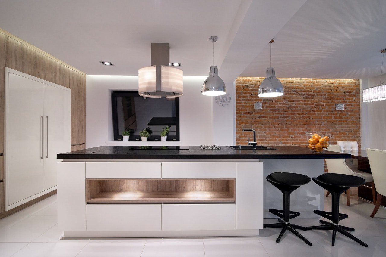
If you have an office in the corner of the living room, it is time to hide the computer and the files. Make sure that your potential buyers or tenants can see plenty of empty space on the photo and put their imagination into work, thinking about arranging their own furniture. If you have old unsightly items in the house, it might be time to pay a visit to the local recycling centre or the charity shop. Don’t display old personal mugs in the kitchen either, and consider removing your kids’ paintings from the fridge temporarily too. Create a sterile and fresh look for the brochure, without your footsteps being visible on the images.
Get Rid of Personal Items
You don’t want your letters, certificates, diploma, or anything else displayed on the walls that gives out too much about you. People generally make judgments about the homeowner, and you don’t want people to know your true identity, unless they are signing the agreement. Keep your own and your children’s information safe. Not all people who will turn up on viewings or look at photos are potential buyers. Some of them are simply other homeowners looking for ideas or comparing your home to theirs. Stay out of the pictures as much as you can.
Absolutely No Pet Beds
Most buyers and potential tenants are discouraged by seeing a dog bed or a cat tree in the middle of the picture. Even if they are animal lovers, displaying these items can look unprofessional for them. If someone has pet hair allergies, they will simply not turn up, even if you clean your home thoroughly before viewings. Try to make all the reminders of current residents disappear before the pictures are taken, including the four-legged family members.
Tidy Up Your Kitchen

You will need to make your kitchen look organized and new. If you have to, move some of your small electricals into the garage or the garden shed to make your kitchen look bigger, do so. If you display your utensils and cups on the counter, and have a knife stand, you can move it somewhere else while the photos are being taken. Don’t move your larger appliances, such as your fridge, microwave, kettle, and toaster, but make sure that you are not giving the images the impression that the cupboards are not large enough to hold everything. Show off your Kitchen Design in the best way possible.
Clean and Empty Your Bathroom
Make your tiles in the kitchen and bathroom shiny, and remove any mats, blinds, and personal items. Your potential buyers or tenants would like to see the house in the state they will move in, and the fewer items you have on display the bigger your rooms will look. Get rid of the towels and the bathrobes, along with the cosmetic products, toothpaste, and toothbrush, so you can show the bathroom as an empty canvas. Pay attention to the grouts, as they can go grey or black in the bathroom, and if this shows in the pictures, your potential buyers will assume you have a mould problem and will not consider booking a viewing.
Take Furniture Away
In case you have too much furniture, your rooms will look smaller than they really are. Anything that looks out of place should be stored in the garage, or even in a self storage facility until the viewings are over, and you can get moving. Anything that is too old or looks tired can be removed. Even if you got an armchair from your grandmother and you don’t want to part from it, you can still relocate it temporarily. Look through the colour scheme of each room and search for items that don’t look right. Keep the design simple, and don’t distract your potential buyers or tenants by too many details, as this will make it harder for them to think clearly about their plans and future interior design.
Add Plants
Plants make your house look homely, and they are portable, so people looking at your property’s brochure will not think that they are going to take their space away. Adding a bit of greenery makes the pictures seem brighter and friendlier. Have a flower bouquet displayed in the window and decorate your mantelpiece with small green plants, such as cactuses. Anything that is small and has a decorative value can be a positive addition to the picture, and anything that looks out of place, too big, or old should go. As a general rule, try to have one plant in each room; either by the window, the sideboard, or the table.
Move Your Lamps
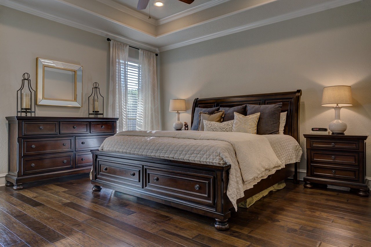
You might want to move your temporary lights and lamps when you have your picture taken for a better lighting solution. You need to consult with your agent or photographer about the optimum locations. You might be asked to move the bedside lights away, so the room looks larger. Bedroom sizes matter for potential buyers, so you have to do anything you can to make the space appear larger. You will also have to potentially change the direction of your spotlights in the kitchen and the landing, depending on where your photographer is taking the pictures from.
Make the Beds

There is nothing more disappointing for potential buyers than a messy bed. You will need to make your bedroom look as if it was a hotel room designed to impress visitors. Get rid of hair, cat hair, and don’t leave any clothes out. Open the curtains and make them look symmetrical, allow natural light to enter. Leave some soft furnishing in the room, to make it look comfortable and cosy.
In Summary…
The secret to staging your home for the sales or rental brochure is to know and understand your target market. Talk to your agent or research the market to make sure you are not focusing on the wrong audience. Remove unnecessary clutter from the house, as less is more. Add some greenery and light, and do the spring cleaning. Take your personality out of the house, and allow your potential buyers to imagine their own designs in your space. Focus on soft furnishing, and make your home look bigger by removing furniture. Make sure that you don’t leave any sign of pets in the house when your photographer turns up.
* This is a collaborative post.

